OPEX Engine Filters and Dashboard
SaaS Benchmarking solution & SaaS Metrics for finance. OPEX Engine provides 250+ accurate and comprehensive benchmarks and analytics for business metrics to help SaaS and Software companies to significantly improve operational performance.

Overview
The client wanted to enhance Benchmark Engine’s Filters User Interface and User Experience to make it easier for the users to access the key benchmarks used in their quarterly and annual business planning. They also wanted to make the benchmark engine’s dashboard more informative for the users so that they can seamlessly use the tool in their day-to-day business decisions.
Old Design
Approach
Requirements Gathering
Comprehensive study on OPEX Engine’s business objectives, services and requirements. Analyzed the application to understand its operations and areas of improvement.
Information Architecture
Structured the benchmark filters flow and organized the components of the dashboard in a clean and easy to read way that supports an intuitive user journey.
Stratergy
Lead with Key data was the focus during the entire design process. This helps the users to cut out the bunk and know what’s important in an instant, saving users time.
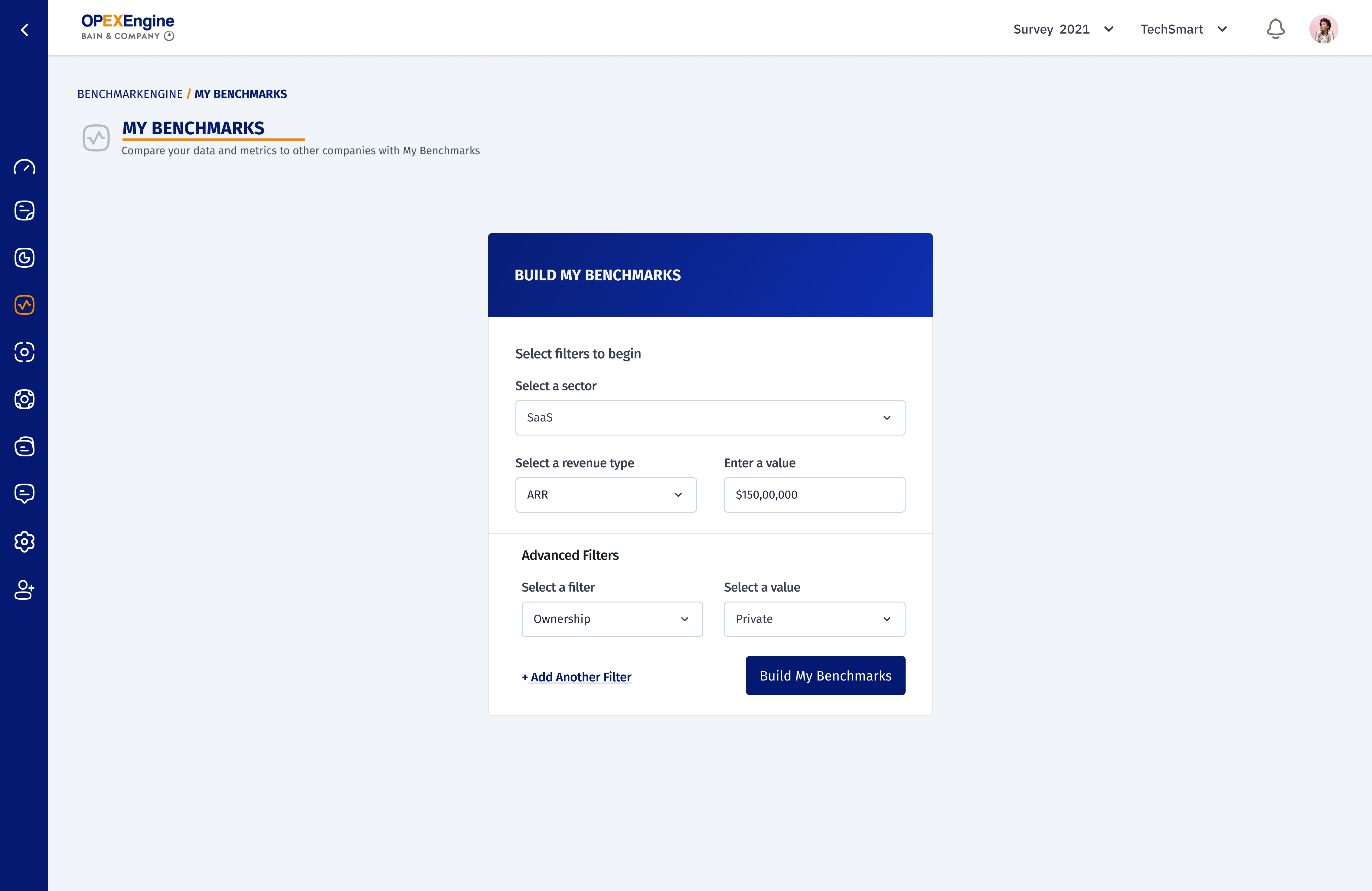
Step 1: Creating a smooth and effortless Benchmark Filter Experience
Started with analyzing the existing platform, followed by user research. From the obtained information, created wireframes and user flows. Styled the filter flow pages with on-trend modern and clean design.
Following that, the result page and its features are designed in a way that allows the users to control which data they want to see and when. The features we added on the results page helps the user to perform their task without any deflection.
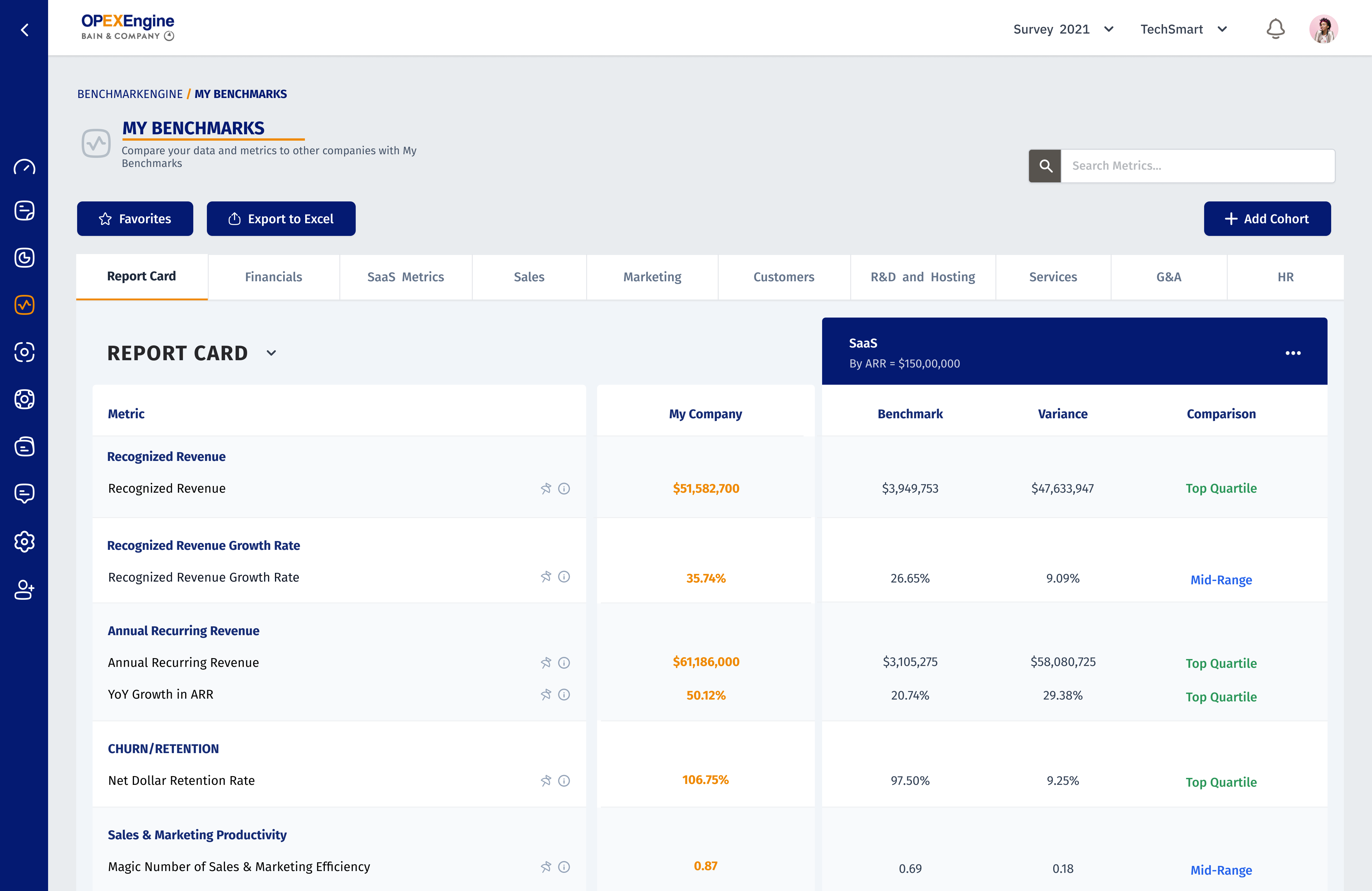
Step 2: Designing a Dashboard of Maximum Engagement
Dashboard was designed based on the best dashboard design practices. The designed dashboard was a high level overview of data with easy paths for users to increase the level of granularity. Added responsive design to the dashboard.
One of the main features from the benchmarks page was pinning the metrics to the dashboard. We grouped all those metrics onto a classic one-pager, which likely helps achieve better engagement with the dashboard because users won’t have to sort through multiple pages. Balanced the metrics with suitable white space to create breathing room for the data.
To make the design consistent over the platform, the design practices followed in the benchmarks page were applied to other pages with similar data representation.
New Design
Conclusion
In conclusion, OPEX Engine's challenge of enhancing their Benchmark Engine's Filters User Interface and User Experience was successfully met. Through comprehensive research, information architecture, and strategic design, the benchmark filters and dashboard were designed with modern and clean design, allowing users to control which data they want to see and when. The features added to the results page and dashboard help users to perform their tasks without any deflection, creating a seamless user journey.