
Yuva Kabaddi Series Official App
The Yuva Kabaddi Series (YKS) is India's first year-round youth kabaddi league, and a pathway into the Pro Kabaddi League and the national team. The league wanted one app where fans could follow every tournament, watch live, book seats and play along. I designed it independently from start to finish, in both dark and light themes.
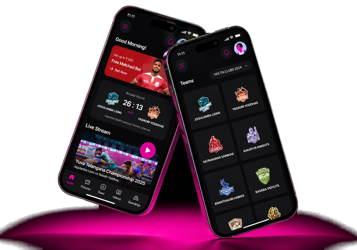
Overview
YKS has played 2,600+ matches across 24 state associations, drawn 378M+ social media views and sent 184 players to the PKL. The league already had an app, but it did very little, so fans still had to piece the season together from streams and social media.
Pain points I solved
- Everything was scattered. Scores, schedules, highlights and tickets were spread across the FanCode stream, social media and word of mouth. → One home for everything
- Many tournaments ran at once. National, state, women’s and All Stars editions each have their own teams, rounds and format. → A tournament switcher on every screen
- Kabaddi’s scoring confused new fans. Raids, tackles, super tackles and booster points don’t fit football or cricket patterns. → A stats language built for kabaddi
- Sign-up walls drove fans away. → Guest-first access
- Buying a seat was guesswork. → Ticket booking in five steps
- Fans had no reason to return between match days. → The engagement loop
- Players had no public record. → Profiles that work as a career record
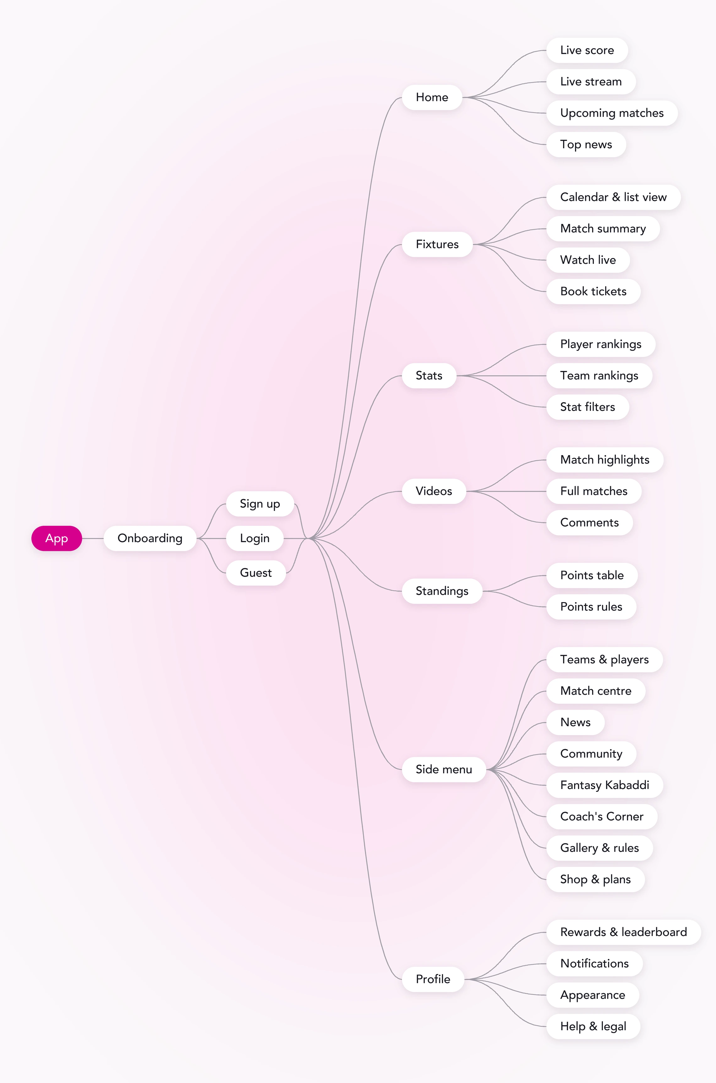
User journey
Sorted by how often fans actually use it.
Every fan starts with onboarding, then signs up, logs in or continues as a guest. From there, the five things fans use every day sit in the tab bar, and everything else is one tap away in the side menu or profile.
- Home
- Fixtures
- Stats
- Videos
- Standings
- + 13 in the menu
Key design decisions
1. Quick sign-in
Fans can sign in with Google, Facebook, Apple or their mobile number, or skip sign-in and look around first. Mobile sign-in is confirmed with a four-digit code.
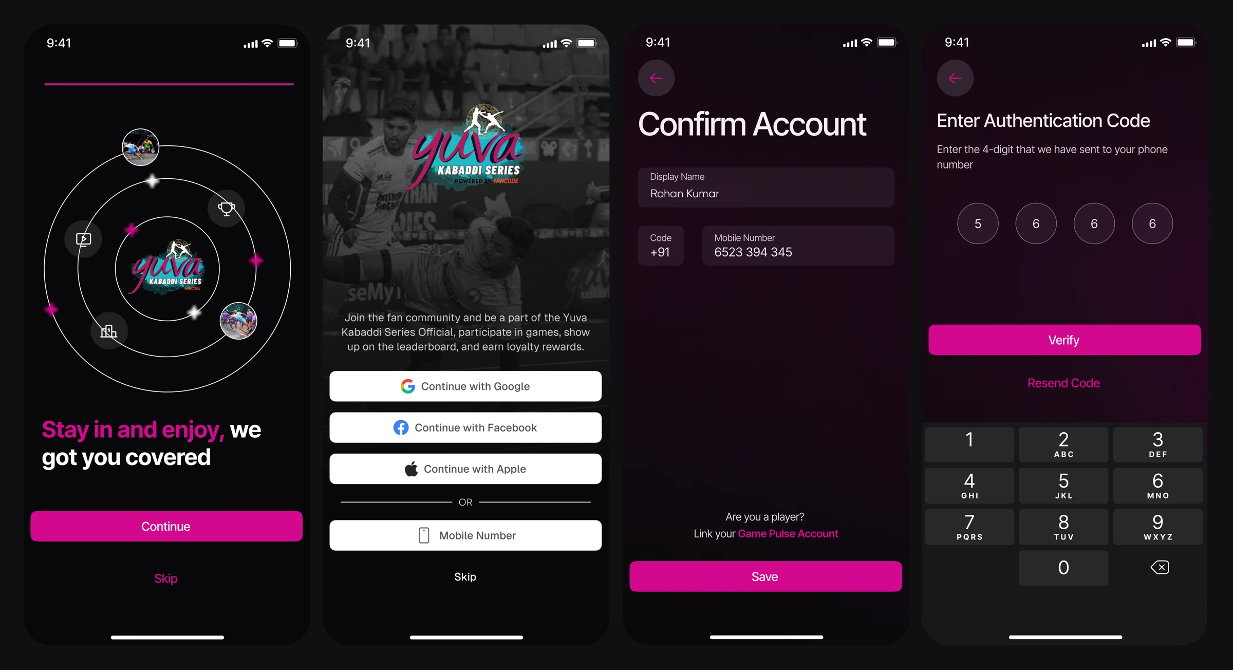
Players can also link their Game Pulse playing account, with designed states for linked, not found and invalid code.
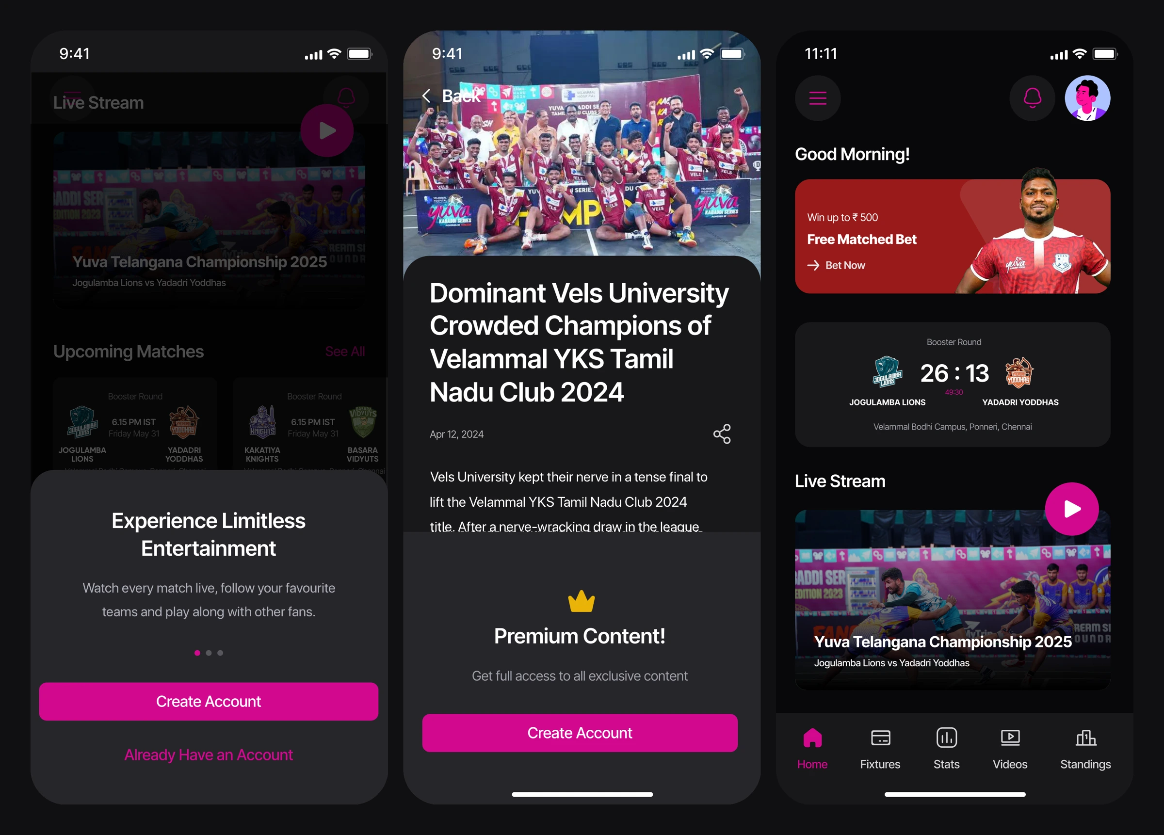
2. Guest-first access with soft gates
Asking for an account too early is the fastest way to lose a new fan. So I designed the whole app to be browsable without one. Guests see scores, schedules and news. The app only asks them to sign up when they reach something that needs an account, like premium articles, chat or ticketing. A crown icon marks premium content throughout, so users know what’s members-only before they tap.
3. Information architecture for 18 modules
With 18 features, the hardest problem was what not to show. I sorted features by how often fans use them:
- Bottom navigation for the five things fans check every day: Home, Fixtures, Stats, Videos and Standings.
- A searchable side menu for everything else: Teams, Player Profiles, Match Centre, News, Community, Fantasy, Ticket Booking, Coach’s Corner, Gallery, Rules and Shop.
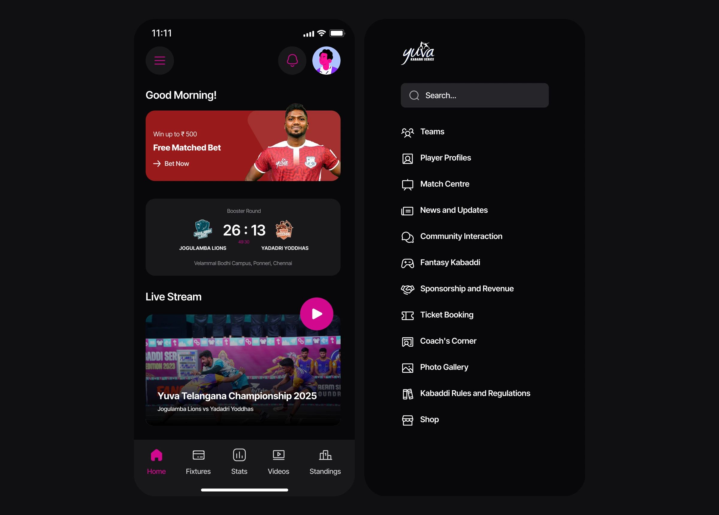
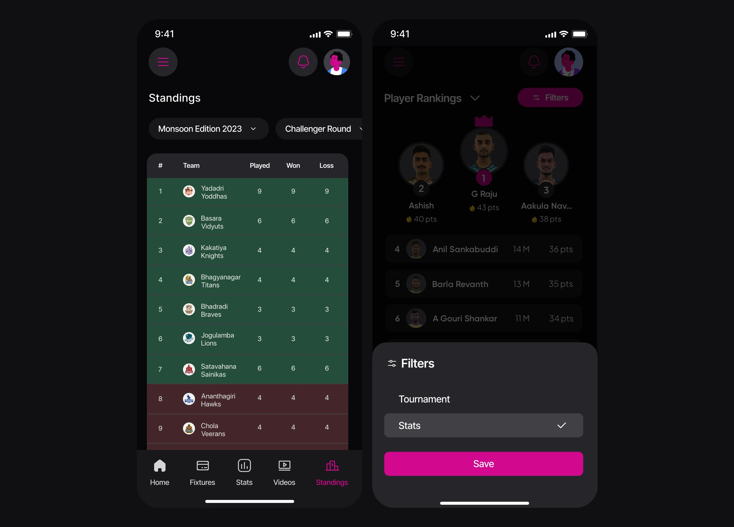
4. One app, many tournaments
Because YKS runs several tournaments a year, every screen that depends on a tournament has a tournament switcher at the top: Teams, Fixtures, Standings, Stats and Player Profiles. Fans pick a tournament like YKS TN Clubs 2024 once, and the teams, fixtures, tables and stats below it all update to match. Standings also let fans switch between rounds, like the Challenger and Booster rounds. One set of screens works for a national edition, a state championship or the women’s league, without a separate section for each.
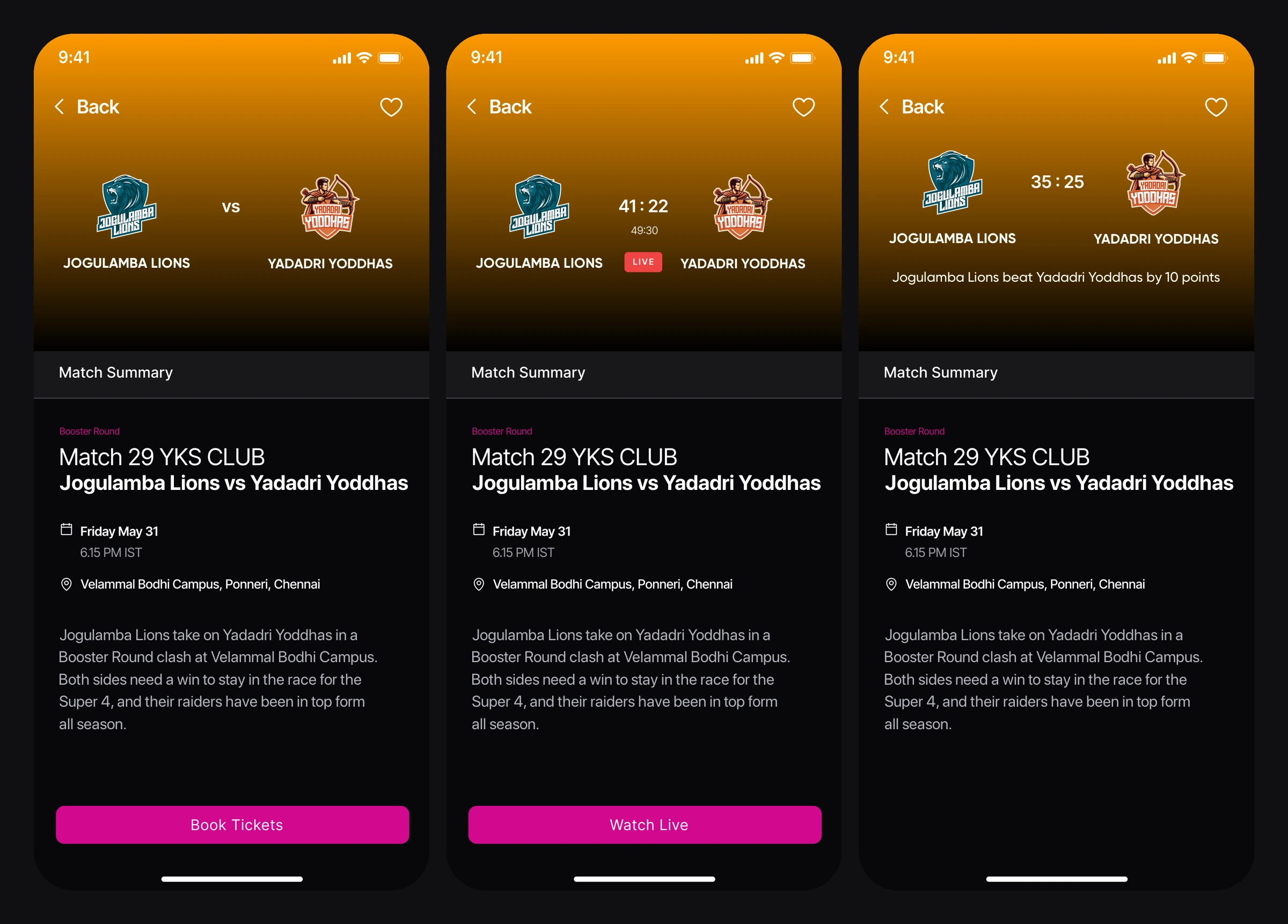
5. One match card, three states
A match is always in one of three states: upcoming, live or completed. Each state needs a different primary action. I designed one match component that changes its colour, its information and its call to action with the state:
- Upcoming (purple): kick-off time and venue, with Book Tickets.
- Live (green): the running score and match clock, with Watch Now.
- Completed: the final score and a one-line result, like “Murthal Magnets beat Himalayan Tahrs (28-21).”
The same logic carries through the schedule (list and calendar views), the home screen and the match summary page, so fans can read a match’s status at a glance anywhere in the app.
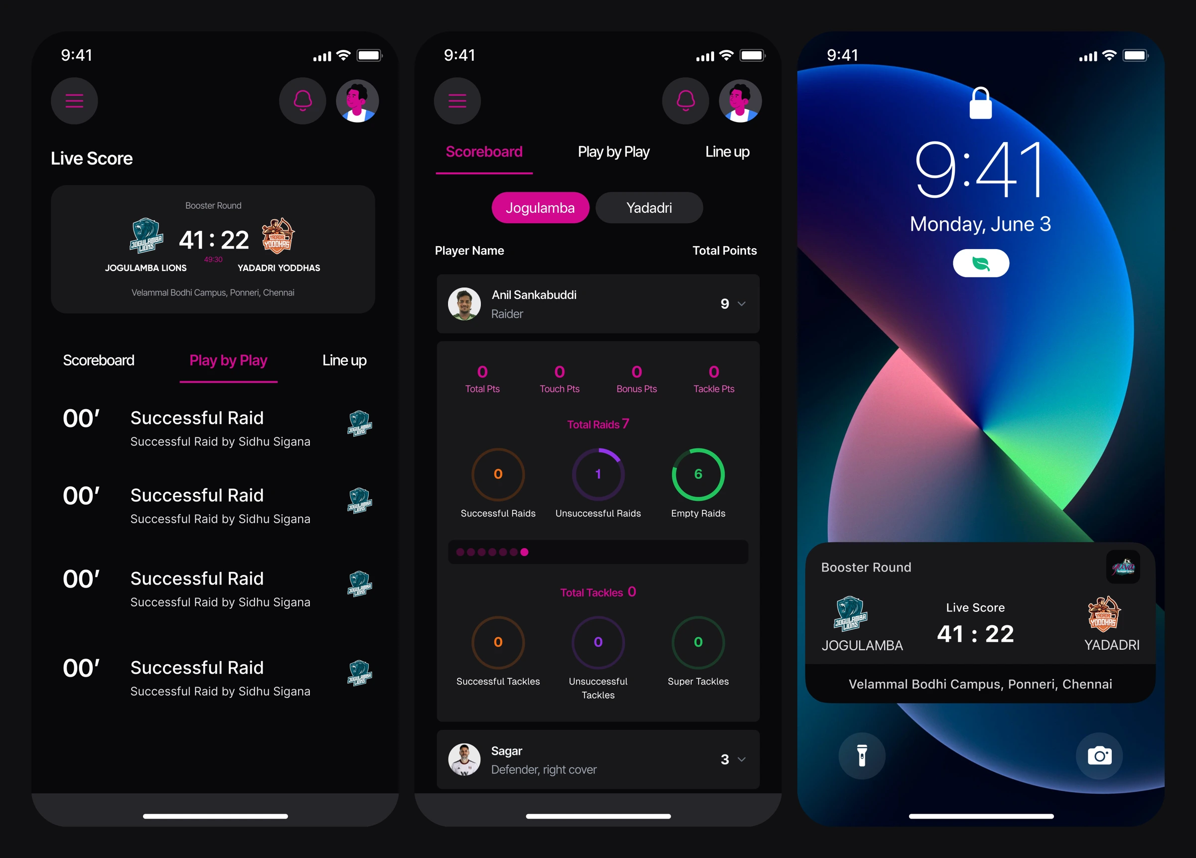
6. Live match centre, even outside the app
Most fans can’t be at the venue, so watching live is the app’s busiest moment. Live matches lead to the stream, which is powered by FanCode, the league’s broadcast partner. Next to the stream, the match centre has a scoreboard, play-by-play and line-ups. Player scorecards break raids into successful, unsuccessful and empty, using ring charts that are easy to read mid-match. Live scores also appear on the lock screen, so fans can follow the game without opening the app.
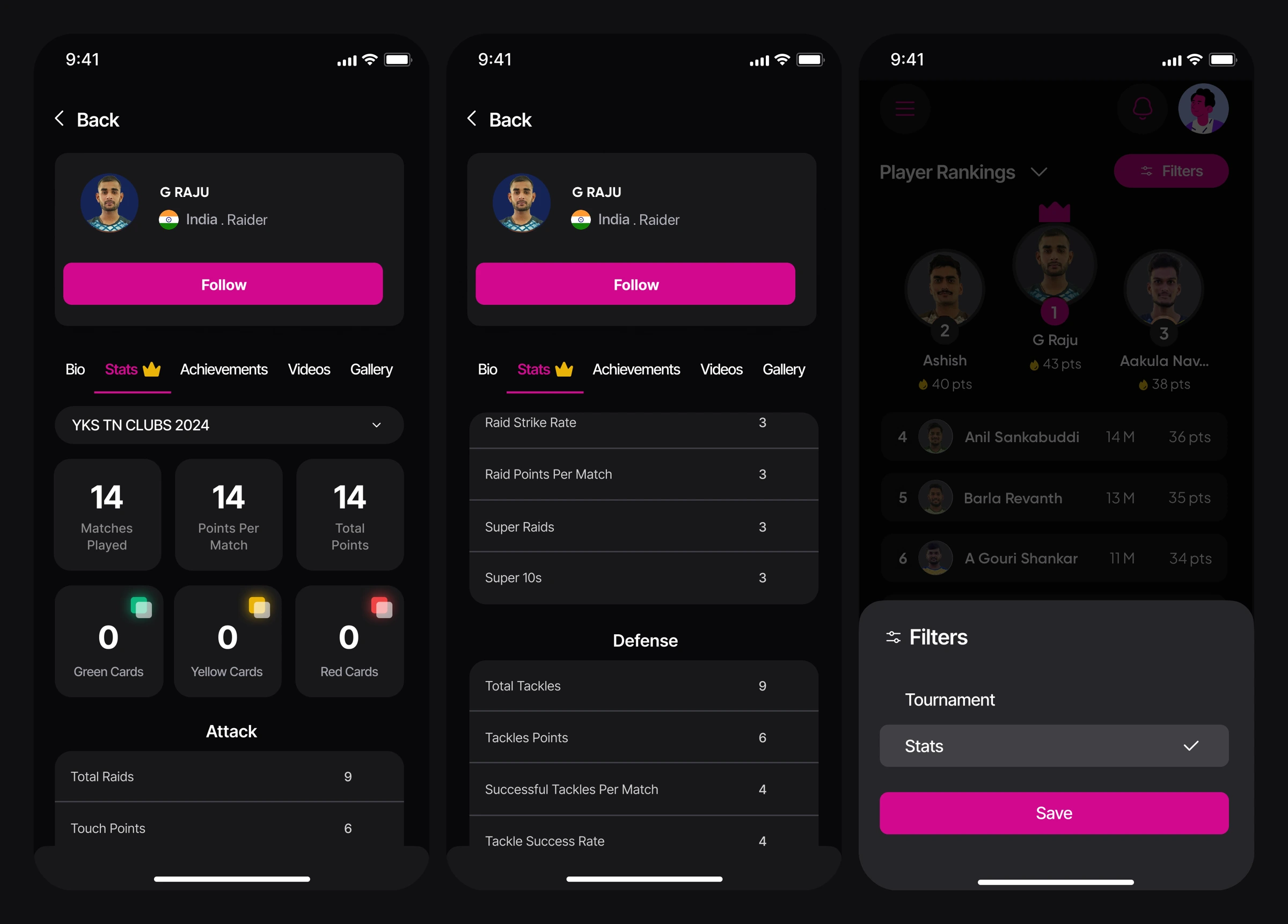
7. A stats language built for kabaddi
Rather than reusing football patterns, I organised player and team stats around how kabaddi is actually played. Stats are split into Attack (raids, touch points, raid strike rate, super raids, Super 10s) and Defense (tackles, tackle success rate). The rankings screen puts a podium for the top three above a filterable list. Fans can rank players and teams by any metric, from successful raids to super tackles.
These profiles matter beyond fandom. With 184 YKS players now playing in the PKL, a player’s profile works as a public career record of their stats across every edition, their achievements, highlight videos and photos. Scouts and fans can follow a young raider’s progress from a state championship to the national stage.

8. Ticket booking without the guesswork
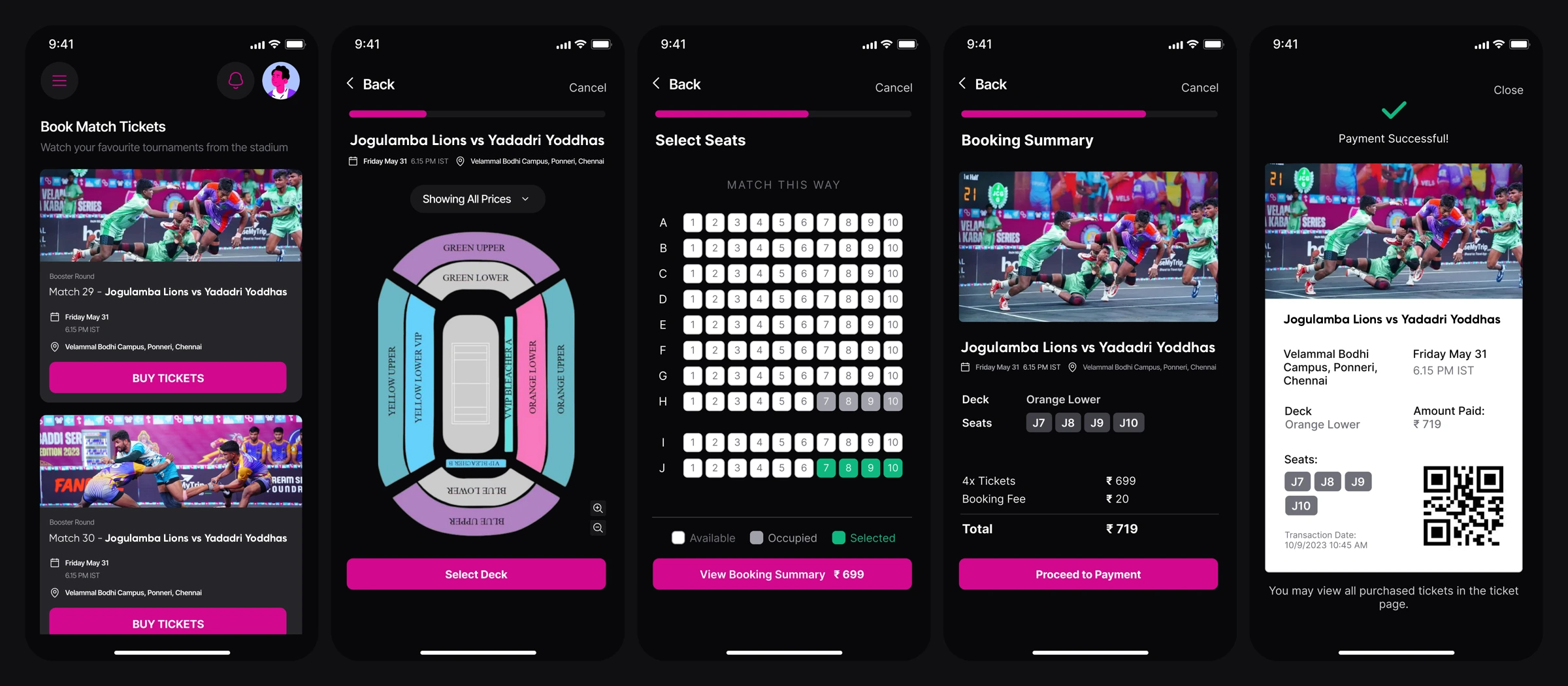
Booking is where the app makes money, so I kept the flow short and kept fans aware of where they are at every step:
- Pick a match. The card shows the starting price.
- Pick a deck on an interactive stadium map, with a price filter.
- Pick seats on a grid oriented to the court (“Match this way”), with available, occupied and selected states.
- Review the booking summary, with the booking fee shown upfront.
- Pay by card, UPI or net banking, the methods Indian users expect.
- Get a QR ticket with the deck, seats and transaction details.
A progress bar runs across the top of the flow, and the price stays on the main button. I also designed field validation, a payment failure screen with a retry, and the empty state for when no matches are open for booking.
9. The engagement loop: Reasons to open the app when there’s no match on
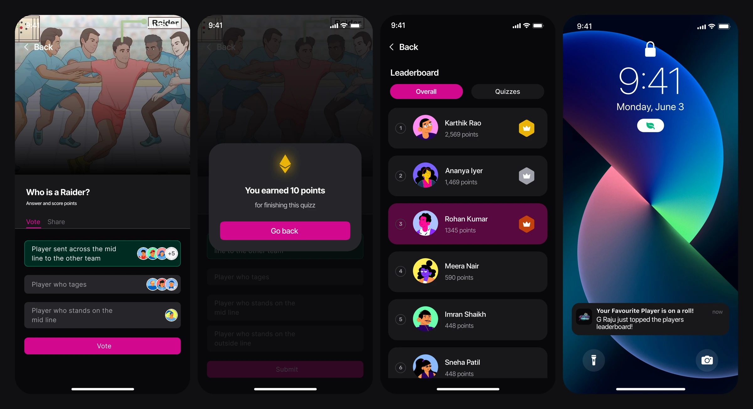
Kabaddi matches happen on set days, so the app needed reasons to open it in between. I designed a loop that rewards participation:
- Polls and quizzes about the sport, illustrated with custom kabaddi court artwork. One example is “Who is a Raider?”
- Points for every quiz completed, which feed a leaderboard with gold, silver and bronze badges.
- Rewards shown on the profile, like “1,345 points, #3 on the Leaderboard”.
- Personal notifications, like “Your favourite player is on a roll!”, which users can switch on or off by category.
10. Coach’s Corner: growing the sport
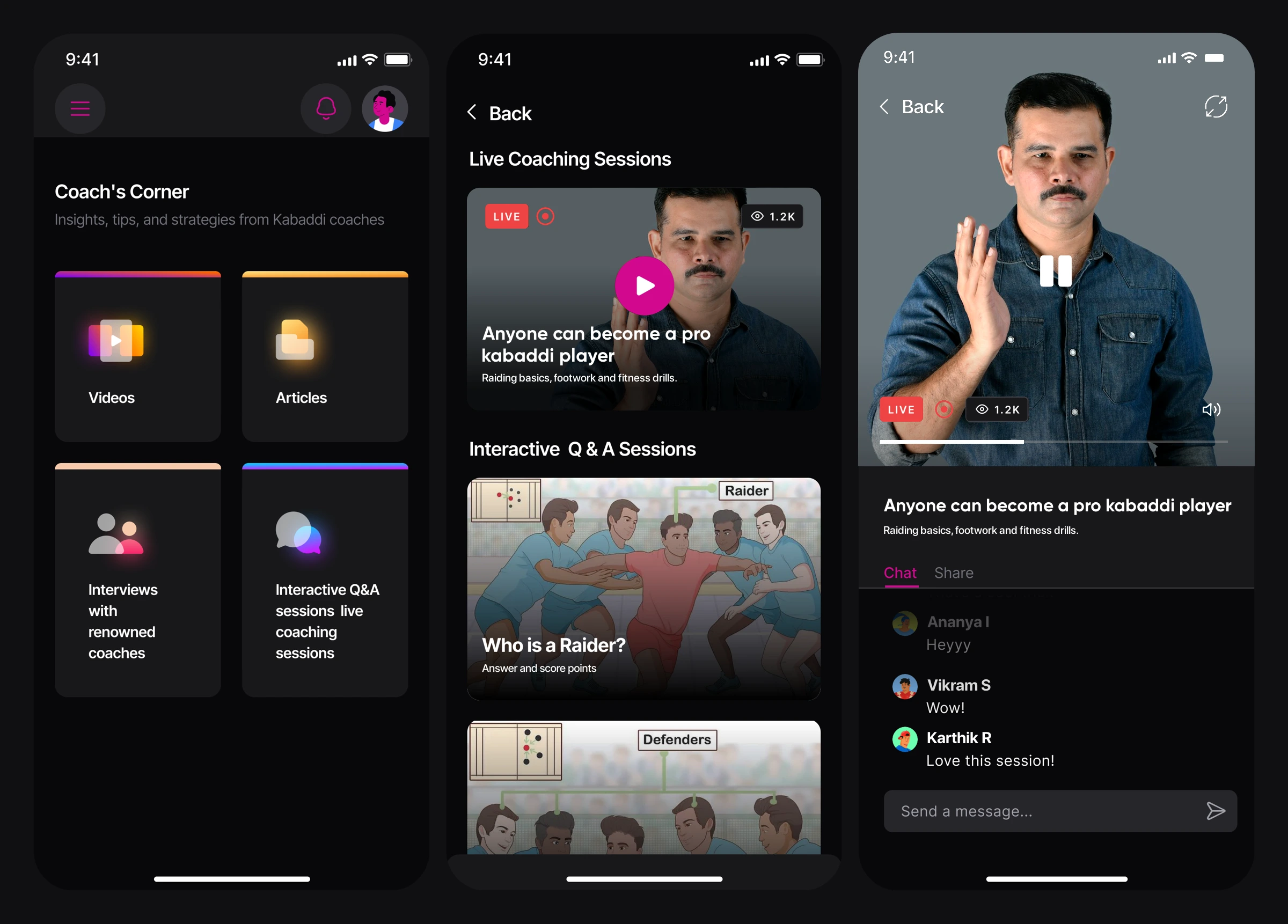
The league exists to develop young talent, so I designed Coach’s Corner as a learning space with videos, articles, interviews with coaches, and live coaching sessions with real-time chat. Fans can also join interactive Q&A sessions. I took this module through two versions, moving from a list to a more visual category grid.
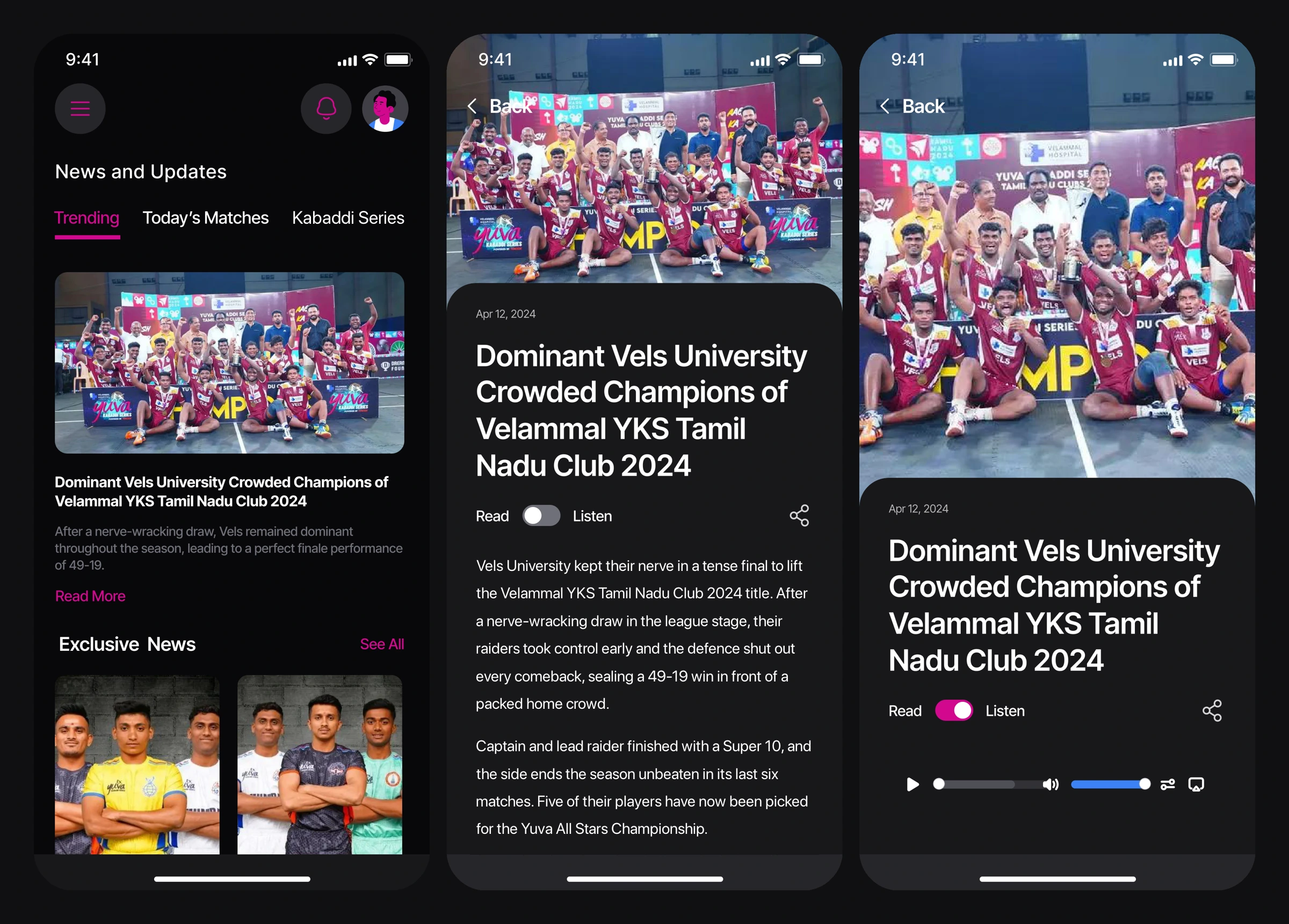
11. Read or listen
News articles have a Read / Listen toggle that turns an article into audio with playback controls. YKS fans come from across India and speak many languages, from rural heartlands to big cities, and many fans would rather listen while commuting or watching. This small addition makes the content work for more people.
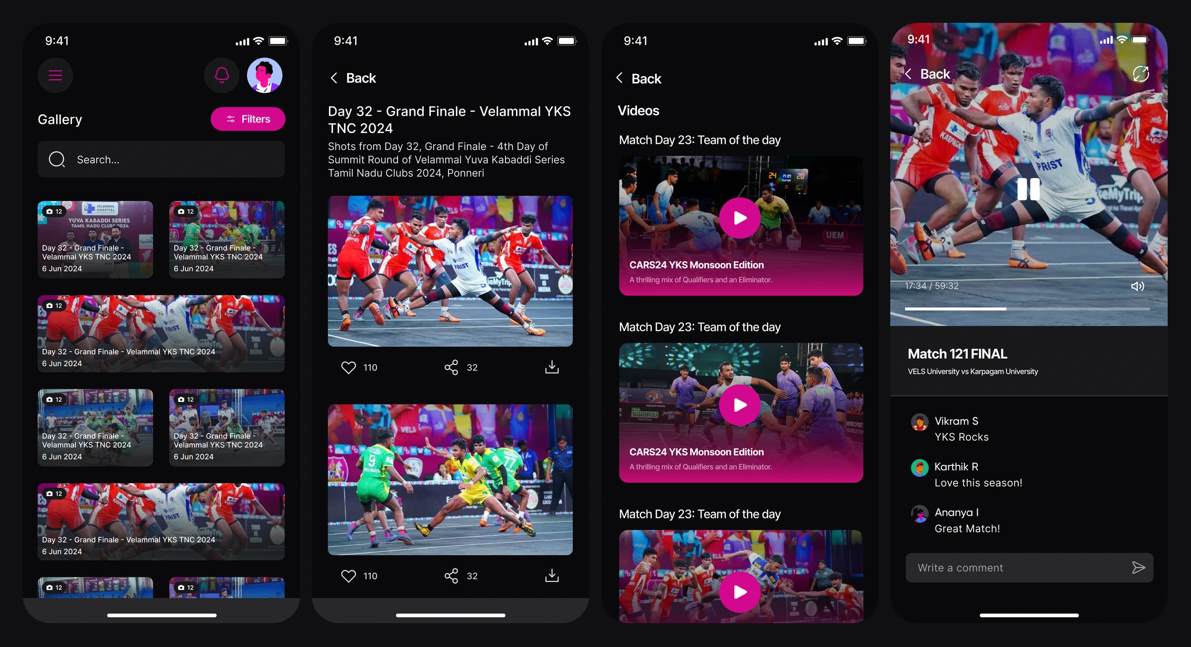
12. Gallery and videos
A photo gallery with an album for every match day, where fans can like, share and download shots. Videos are grouped by match day, and every video has its own comment thread.
13. Making the rules easy to understand
Standings use colour to show which teams are in the qualification zone and which are in the elimination zone. The points table rules, booster points system and qualification criteria are written out in plain language next to the table. A Rules & Regulations hub with a Knowledge Corner helps new fans learn the terms.

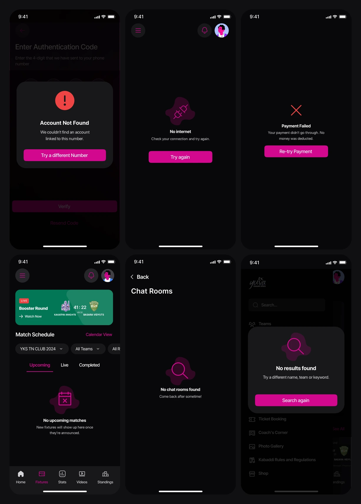
Designing for the moments that go wrong
A design that only covers the best case isn’t ready to build. For every module, I designed the states that real users run into:
- Empty states: no upcoming, live or completed matches, no achievements, no chat rooms, no articles, no videos, no comments
- Errors: no internet, invalid code, account not found, payment failed, and form validation with clear messages
- Confirmations: voted successfully, quiz points earned, payment successful, log out
- Search: “No results found” with a way to search again
All of them share one visual language: a soft magenta blob behind a line icon, a short message and one clear action. Error states feel like part of the product instead of an afterthought.
Dark and light themes
- Yuva magenta#D4078FEvery primary action
- Surface#101012Dark-first base
- Live#22C55ELive and success
- Upcoming#8B5CF6Scheduled matches
- Error#EF4444Failures and alerts
- Gold#F5B82ELeaderboard ranks
Fans open the app in very different places: under stadium floodlights, in bed after a late match, outdoors in daylight checking the schedule. One theme can’t suit all of them, so I designed every screen in both dark and light. Fans can choose Light, Dark or follow their phone’s setting.
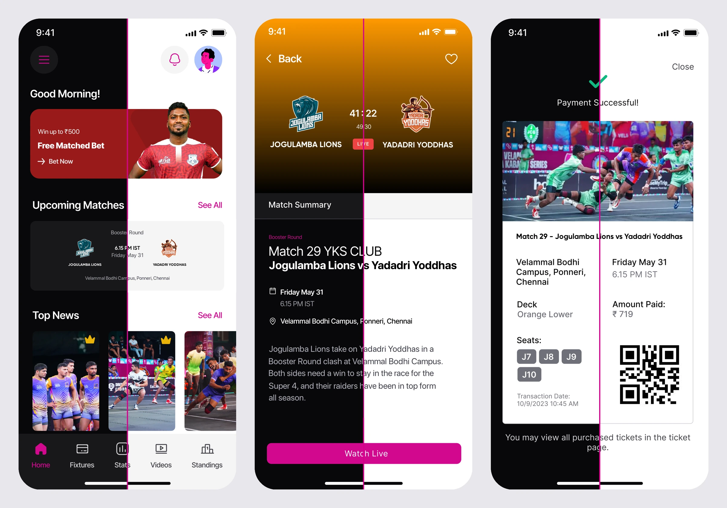
I built the themes as one system rather than two separate designs. Only the surface colours swap. Everything else stays the same, so fans don’t have to relearn the app when the theme changes:
- Same layout and components. Cards, tabs, lists and buttons keep their size, spacing and position in both themes. Near-black backgrounds become white, and dark grey cards become light grey.
- One brand accent. The magenta from the Yuva logo is the same in both themes. Primary buttons, active tabs and highlights are recognisable at a glance and keep enough contrast on dark and light backgrounds.
- Colours keep their meaning. Green still means live, purple still means upcoming, red still means an error, and gold, silver and bronze still mark leaderboard ranks.
- Photos stay readable. Text over match photography and video keeps its dark gradient in both themes, so titles and scores stay legible over any image.
- Illustrations adapt. The blob behind each empty-state icon changes from a deep magenta tint in dark to a soft pink in light, so it stays gentle in both themes.
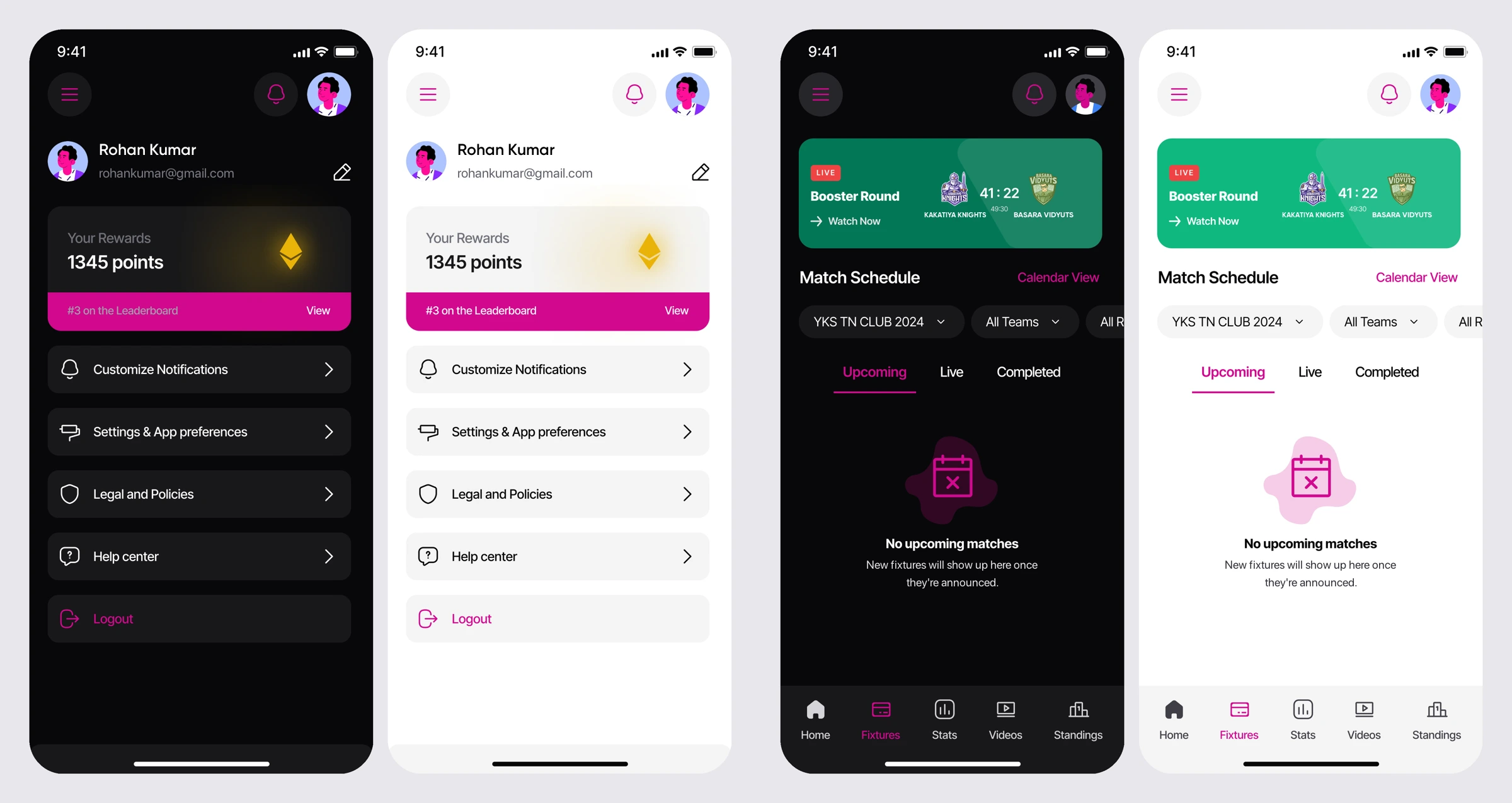
Design system
- Dark-first: sports apps are often used at night and in stadiums, and dark backgrounds make match photography and team colours stand out. The light theme uses the same components, so every screen exists in both.
- Brand accent: a single magenta taken from the Yuva logo is used for every primary action, active tab and highlight, so it’s always clear what to tap.
- State colours: purple for upcoming, green for live and success, red for errors, and gold, silver and bronze for leaderboard ranks.
- Reusable components: match cards, team crests, stat tiles, segmented tabs, filter sheets, bottom sheets and modals are shared across all 18 modules, which keeps 140+ screens consistent.
Conclusion
The Yuva Kabaddi Series app turns a fast-growing national youth league into a complete digital product. A guest-first entry, a clear split between everyday and occasional features, a kabaddi-specific stats language, a ticketing flow that covers every failure path, and a points loop that rewards fans for showing up all sit inside one consistent dark-first design system. Every one of the 18 modules was designed with its loading, empty, error and success states, so the app is ready to build rather than just ready to present.